
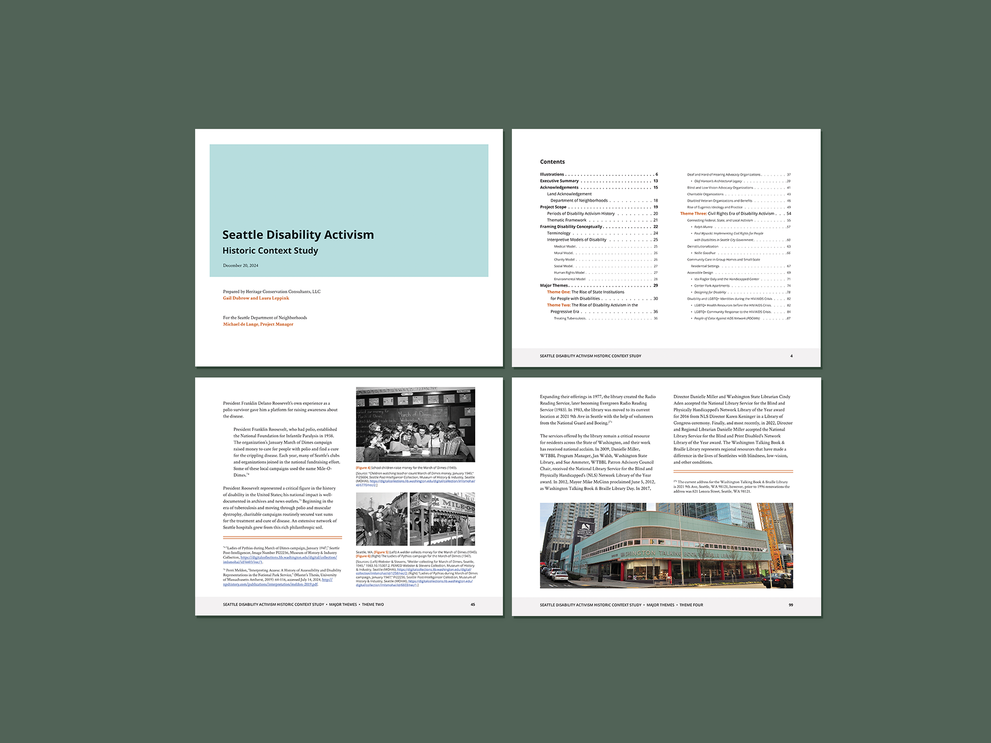
Seattle Disability Activism Historic Context Study
Layout design of an almost 200-page document for the Seattle Department of Neighborhoods. This document is easy and pleasant to navigate and meets PDF accessibility guidelines, including an interactive table of contents, alternative text for images, logical reading order, properly nested labels, tagged items, color contrast, and other digital accessibility features.
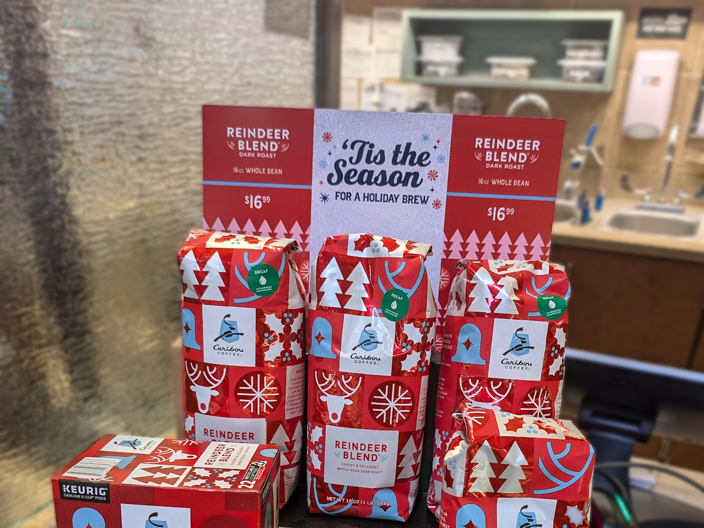
Caribou Holiday Signage
Holiday Coffee bean signage for Caribou Coffee, a leading coffee chain concentrated in the Midwest. I designed five different print pieces that existed as part of a larger holiday branding collection, to specifically highlight their two festive coffee beans (Bold North Blend and Reindeer Blend). I utilized the branding and design elements from the bag design but applied them in a new way to create a fresh design for the signing for this year's rollout.
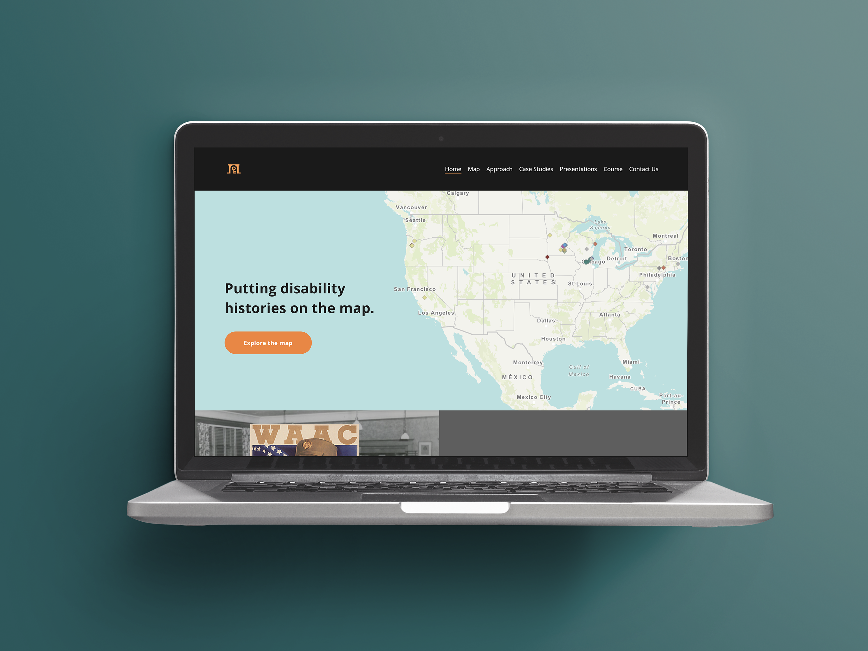
REPAIR History Website
REPAIR: Disability Heritage Collective is a group of learners focused on historic preservation by mapping disability history. I have been working as part of REPAIR to design a website that encapsulates their work so far. Beginning with branding, I also helped with information architecture, UX/UI, and web design to create a site that was welcoming and accessible.
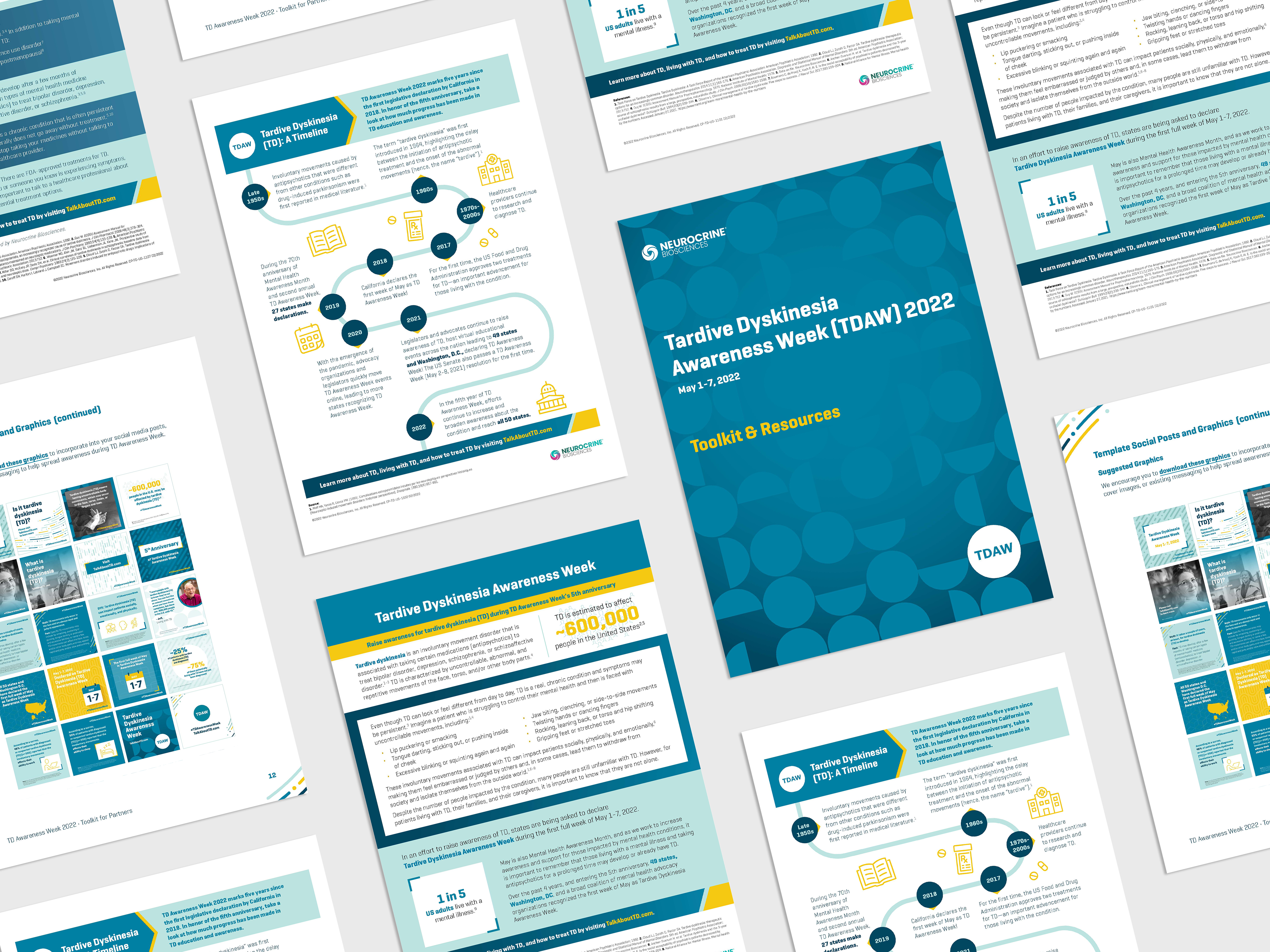
Neurocrine TDAW 2022 (with Spectrum Science)
While working at Spectrum Science, I worked with Neurocrine Biosciences to design materials for their 2022 Tardive Dyskinesia Awareness Week (TDAW). Using the colors and typography they provided, I created a concept for this campaign and designed a toolkit that included materials like a timeline, fact sheet, and backgrounder document, as well as twenty social posts.
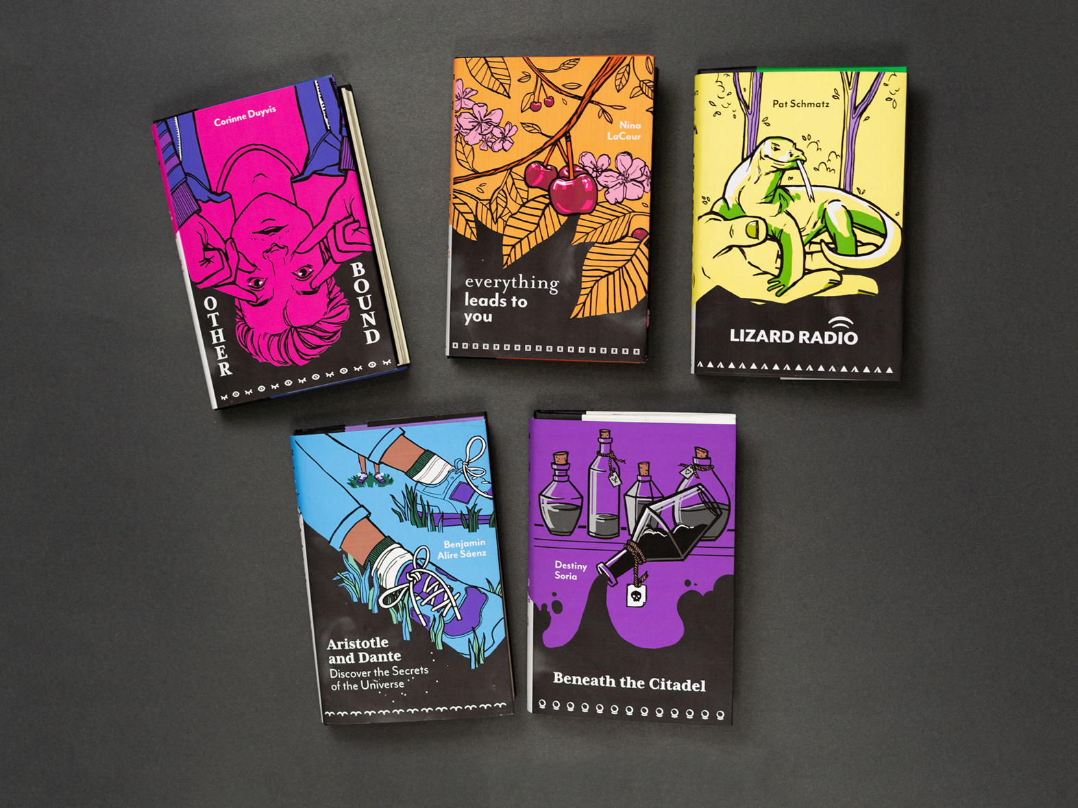
The Month of June Book Collection
This honors thesis explores the history of the LGBTQ+ young adult genre and includes five redesigned books, as well as marketing materials that encourage the enjoyment of the collection.
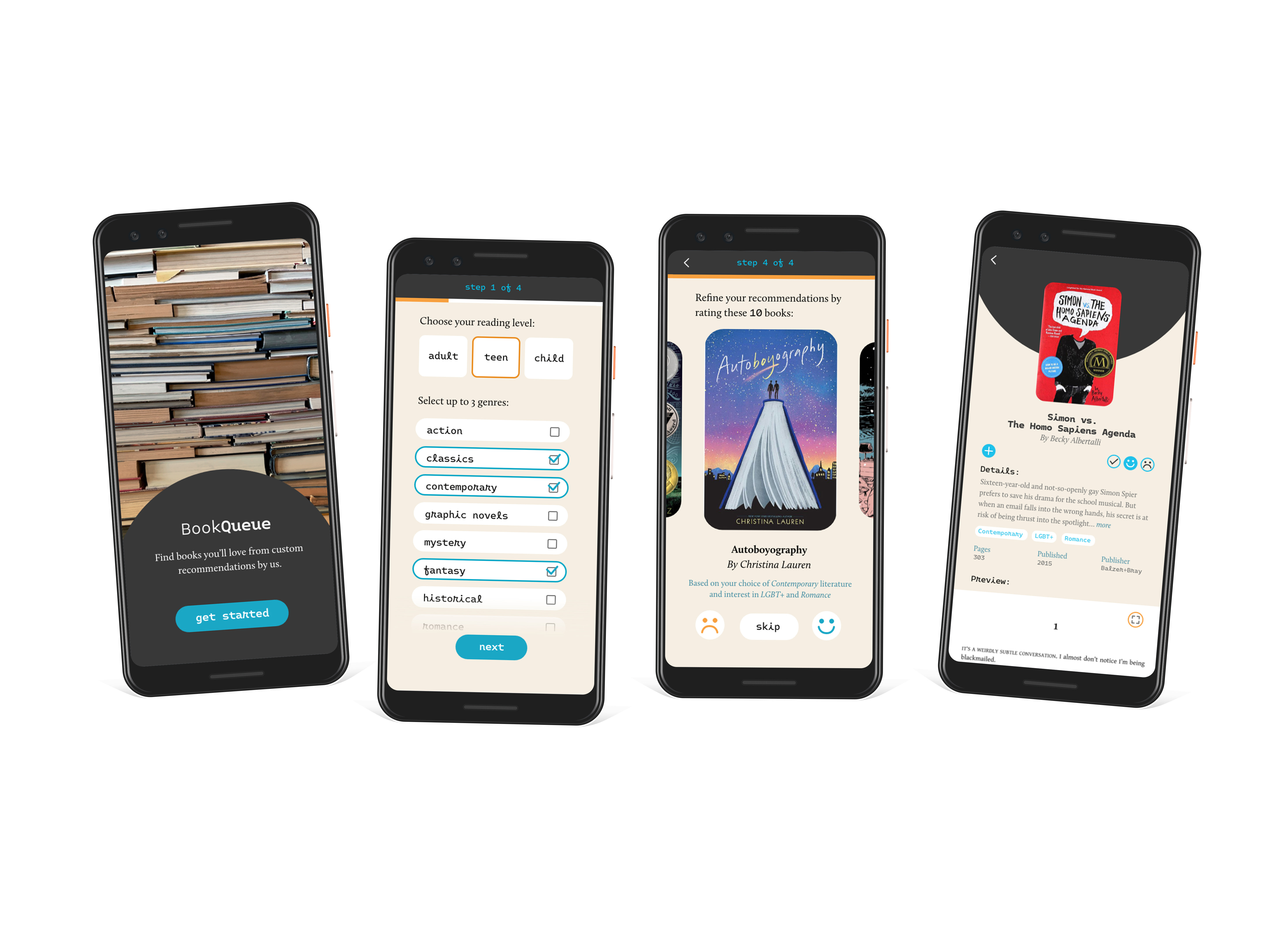
BookQueue: Book Recommendation App Concept
BookQueue is a concept project for a mobile app that provides custom book recommendations. A response to similar apps that are either challenging to navigate or have a frustrating UX, this design involves minimal screen layouts, pleasing visuals, and intuitive information architecture.

Caterpillar Internship
Throughout the summer of 2020, I worked with Caterpillar as part of the Earthmoving and Paving divisions to edit pictures of machinery and design new PowerPoint templates,.
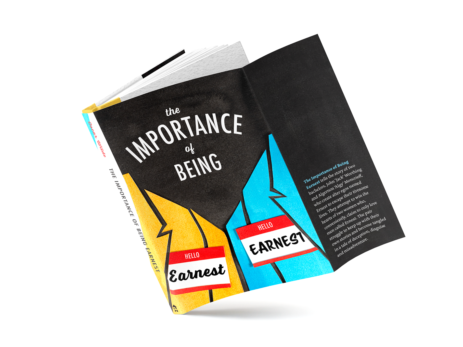
The Importance of Being Earnest Book Design
This conceptual redesign of The Importance of Being Earnest by Oscar Wilde focuses on typography and name tags to interpret the play’s main themes of names and identities.
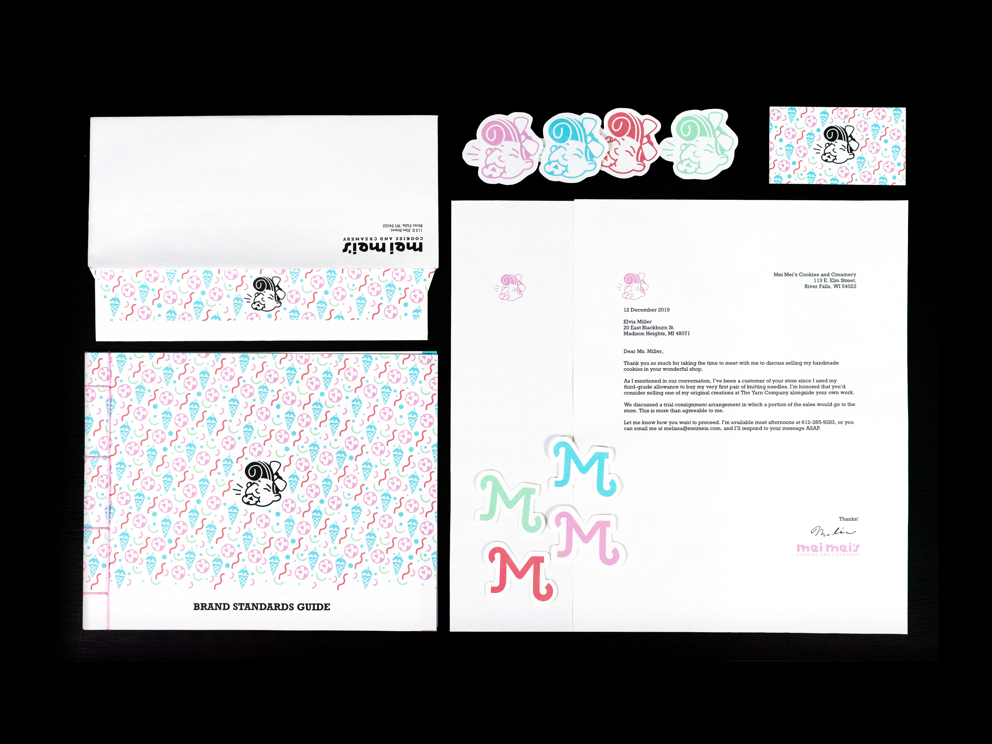
Mei Mei's Cookies and Creamery Logo and Branding
This project is a conceptual rebrand for Mei Mei’s Cookies and Creamery, a specialty shop in River Falls, Wisconsin. The new creative direction references the warm and charming nature of 1950s diners.