
Business Model
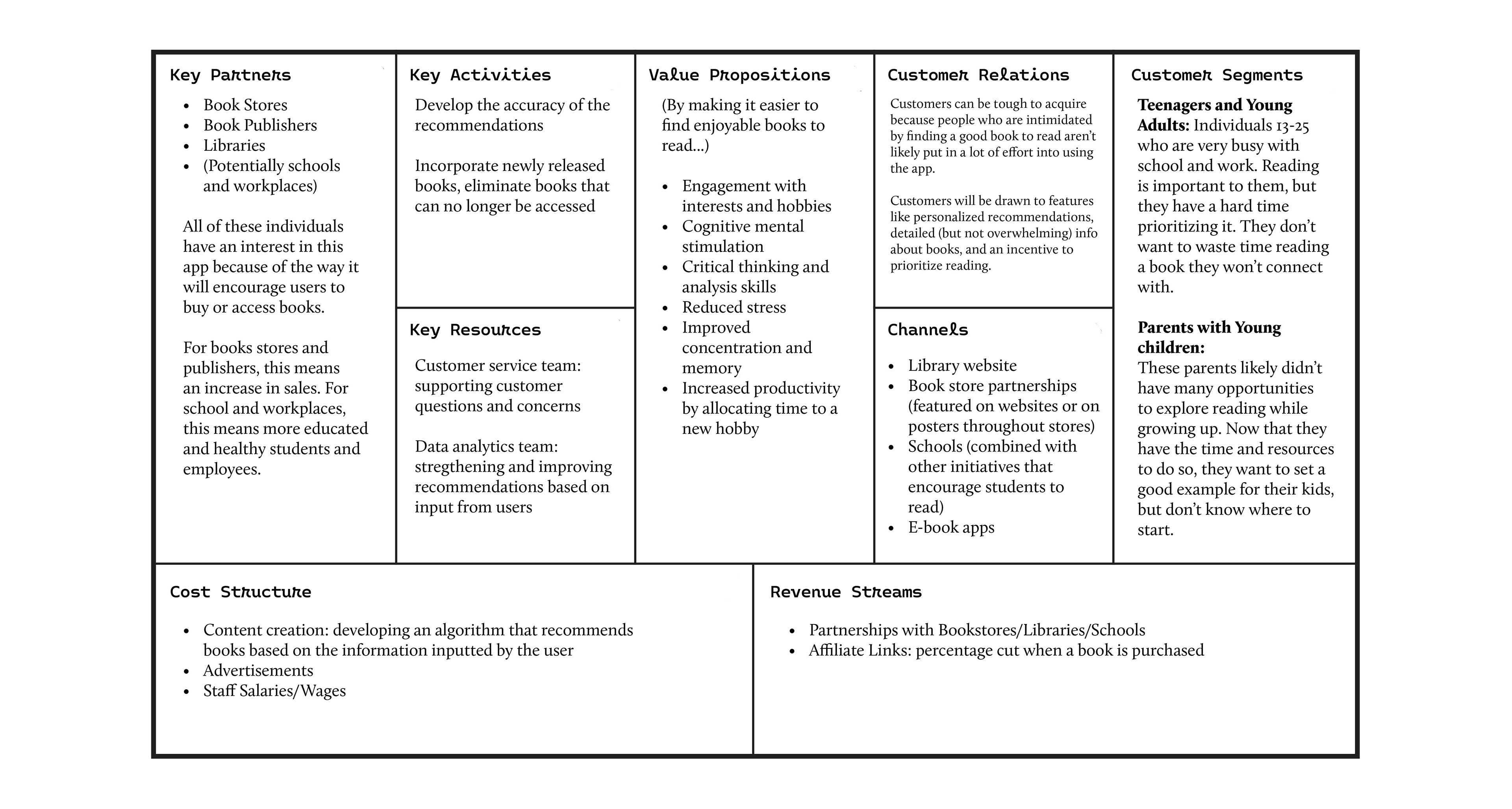
I began this project by making a business model to get a better understanding of the concept and what unique problems it would be solving. I focused on establishing elements like key partners, value propositions, customer relations, and customer segments. Unlike similar apps on the market, which create suggestions based on ratings and reviews from other users, BookQueue provides authentic recommendations based on real answers. There are no guesses or assumptions about what kind of books the user will like.
User Flow
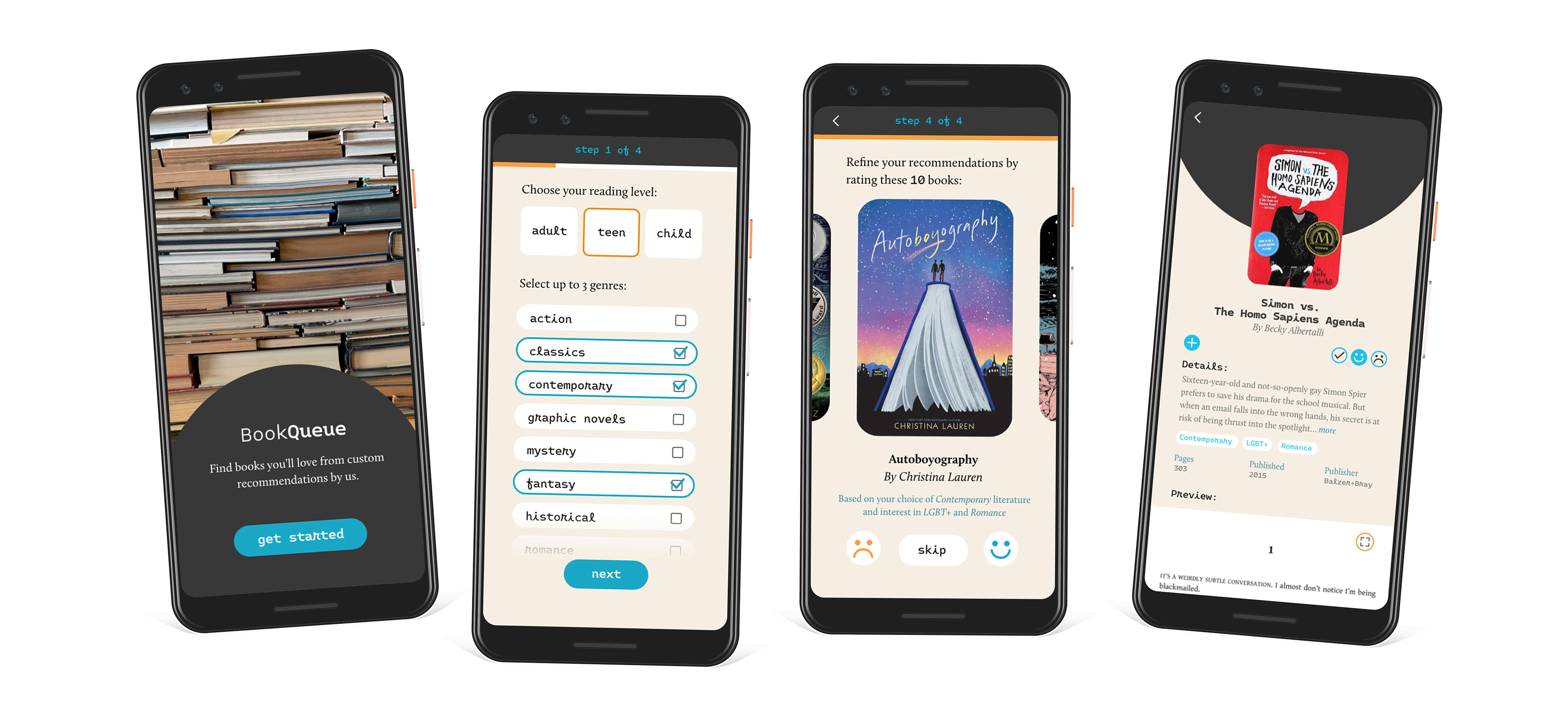
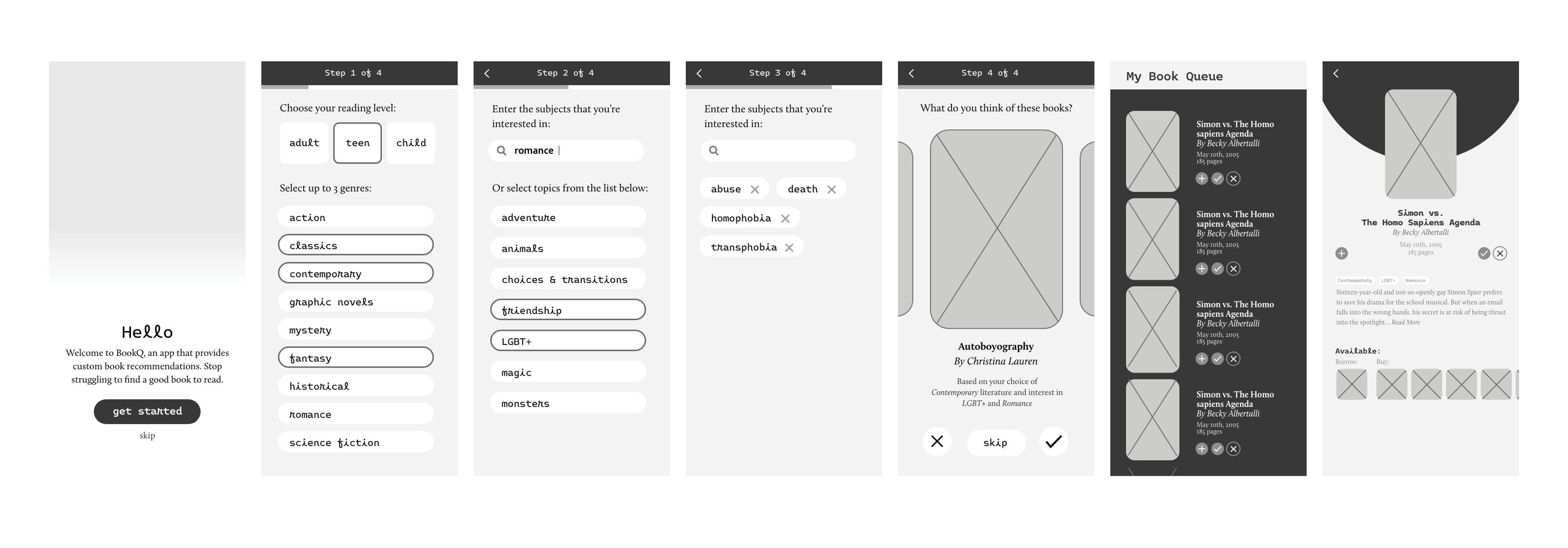
Next, I made a user flow to figure out how a user might navigate the app. The flow begins with the launch screen, then goes through a short survey that includes a few questions. Next, users will rate several books to refine their recommendations. Once the survey is complete, the users are presented with a queue of books to read. This page will become the home page of the app. A menu leads to the app’s other functions, including areas to search for specific titles, refine recommendations, and edit the information provided. Near the bottom of the screen is a button to save the results to a profile.

Initial Ideation and Sketches
To begin the design process, I started with generating ideas and sketches. I started with four different ideas for the launch screen, as I was still trying to figure out what I was doing. As I visualized the rest of the flow, my sketches became more focused and more closely resemble the final design.

Black and White Wireframes
I turned the sketches into black and white wireframes, incorporating their content and hierarchy of information into a digital version. I focused on keeping most screens to just one task and maintaining the user flow.
First Round of User Interface Design
The next iteration of the design utilized colors and pictures. The cream-colored background mimicked aged book pages and the blue and orange act as bright and complementary accent colors. The headers and titles are in the typeface Monotalic, a monospaced sans serif font that’s both friendly and reminiscent of text from a typewriter. The secondary typeface is Calluna, a chunky serif font that looks like a modern alternative to other old-style typefaces typically associated with books.

User Testing: Script and Responses
To understand how real users might interact with the mobile UX/UI design, I conducted some user testing to get feedback on the experience. I started by asking my users a few warm-up questions so that we would both be comfortable during the interview. I also wanted to have a general idea of their experience with reading and finding new books in general. Then, I asked a few questions about the app. I focused on asking about the survey and how confident they’d feel in both the recommendations provided to them and the information available for each book. Their responses, which are listed on the next page, provided helpful insights about simple functions that would be useful. I made some changes based on their comments, including a way to preview a book as well as mark it as read.

Final Result

