Research
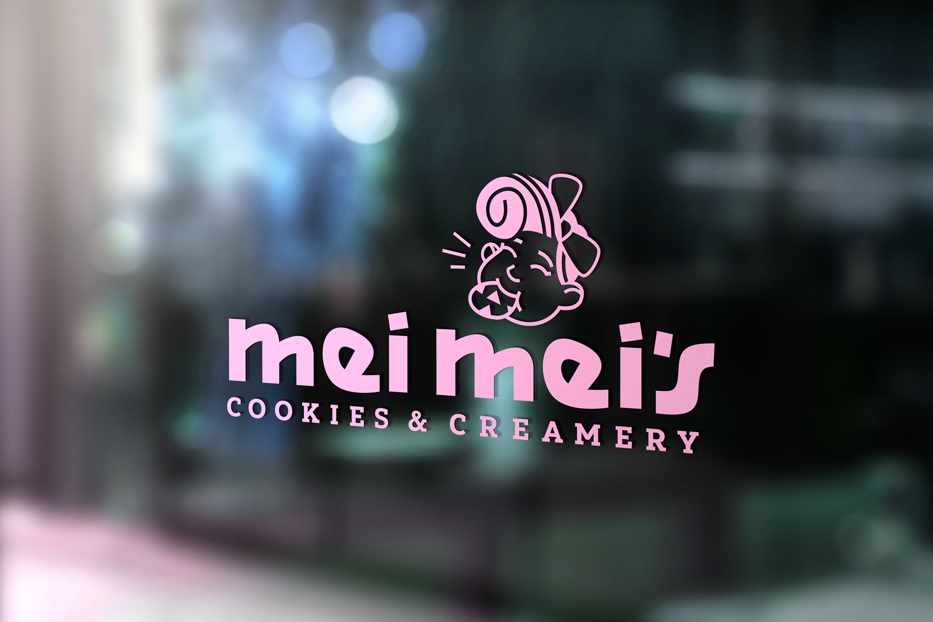
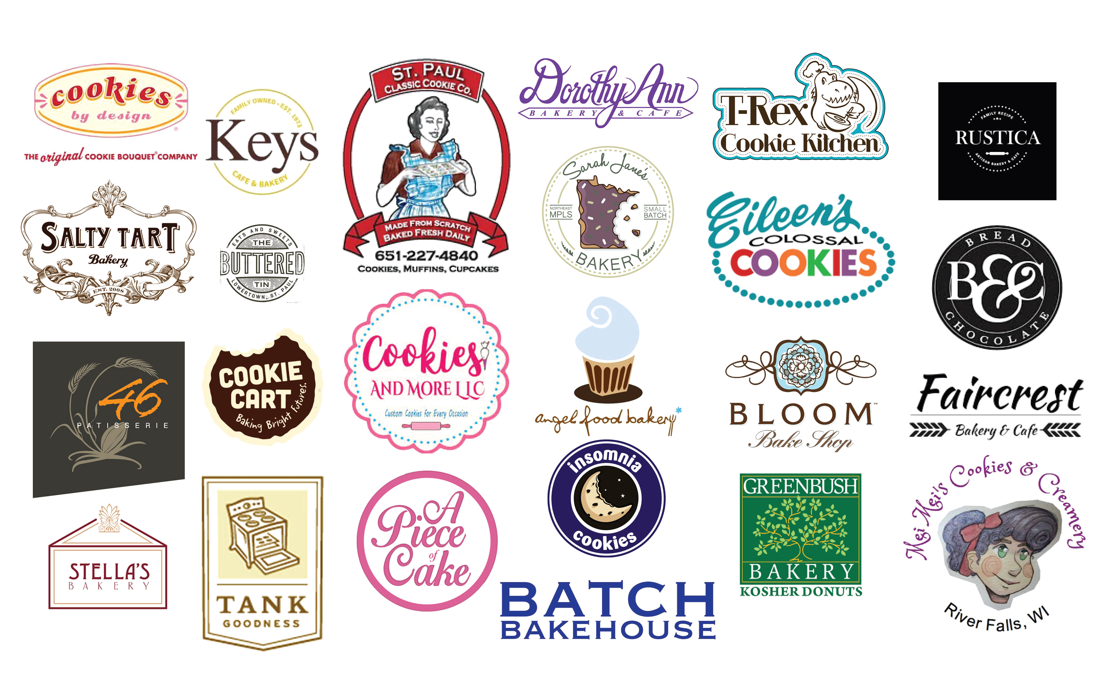
I began this project with a competitive audit of other cookie shops, cafes, and bakeries. I noticed that a lot of their logos are focused on cookies and other circular elements. I wanted to focus on doing something different with Mei Mei’s logo, which is on the bottom right.
Sketches and Ideation
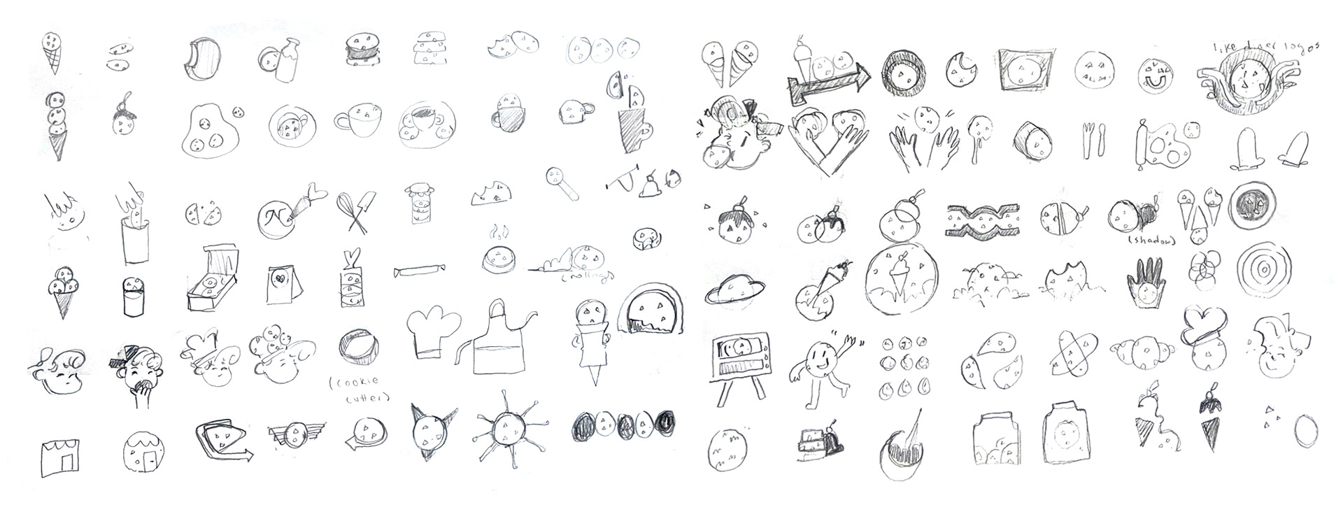
Here are some of the sketches that I made for the logo mark and the logo type.
Process
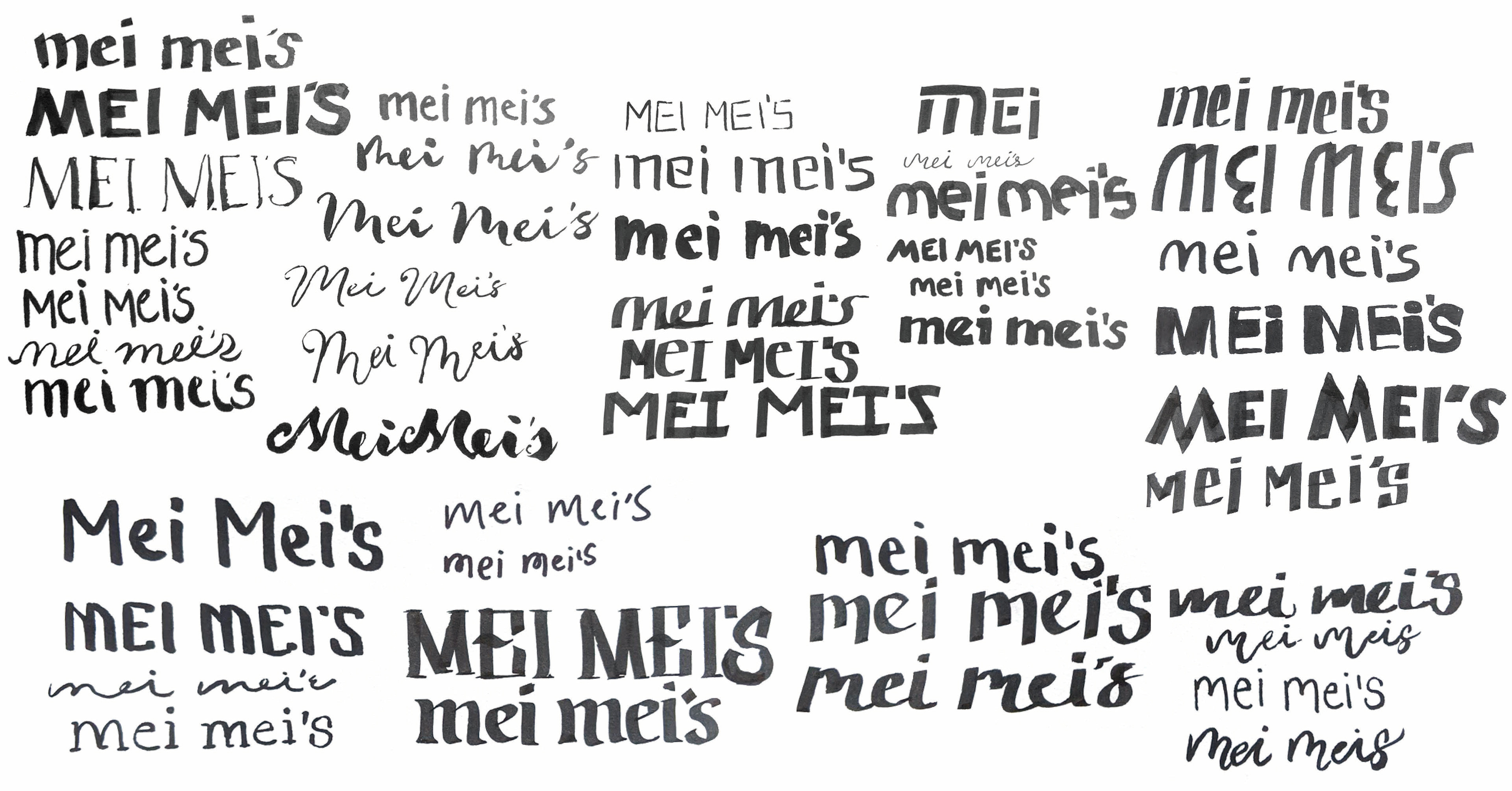
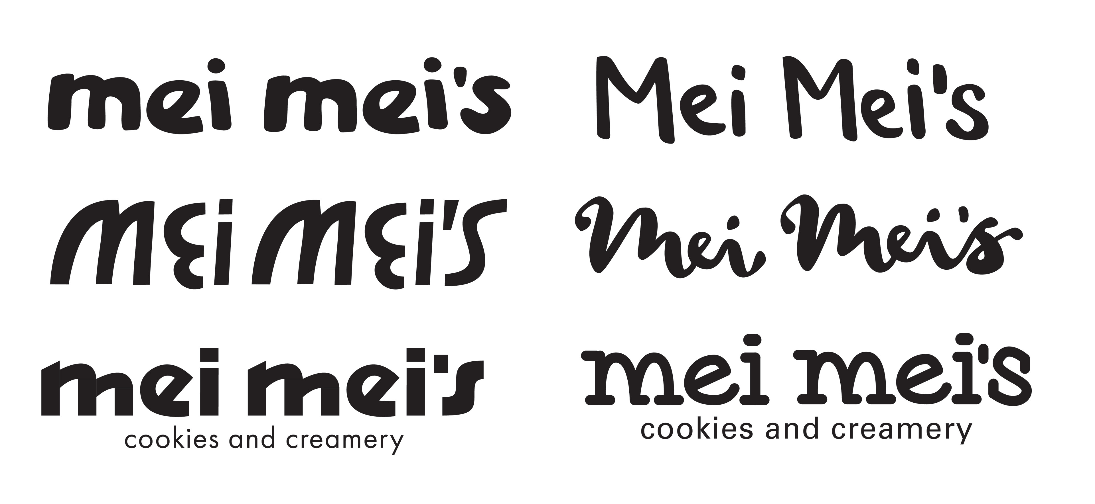
I continued to develop a few different approaches for the logo. For the typography, I explored a variety of custom-made lettering, including styles that looked hand-drawn, geometric, or in the typewriter style. I also worked with a variety of imagery, focusing on more unexpected ways to incorporate cookies and ice cream.

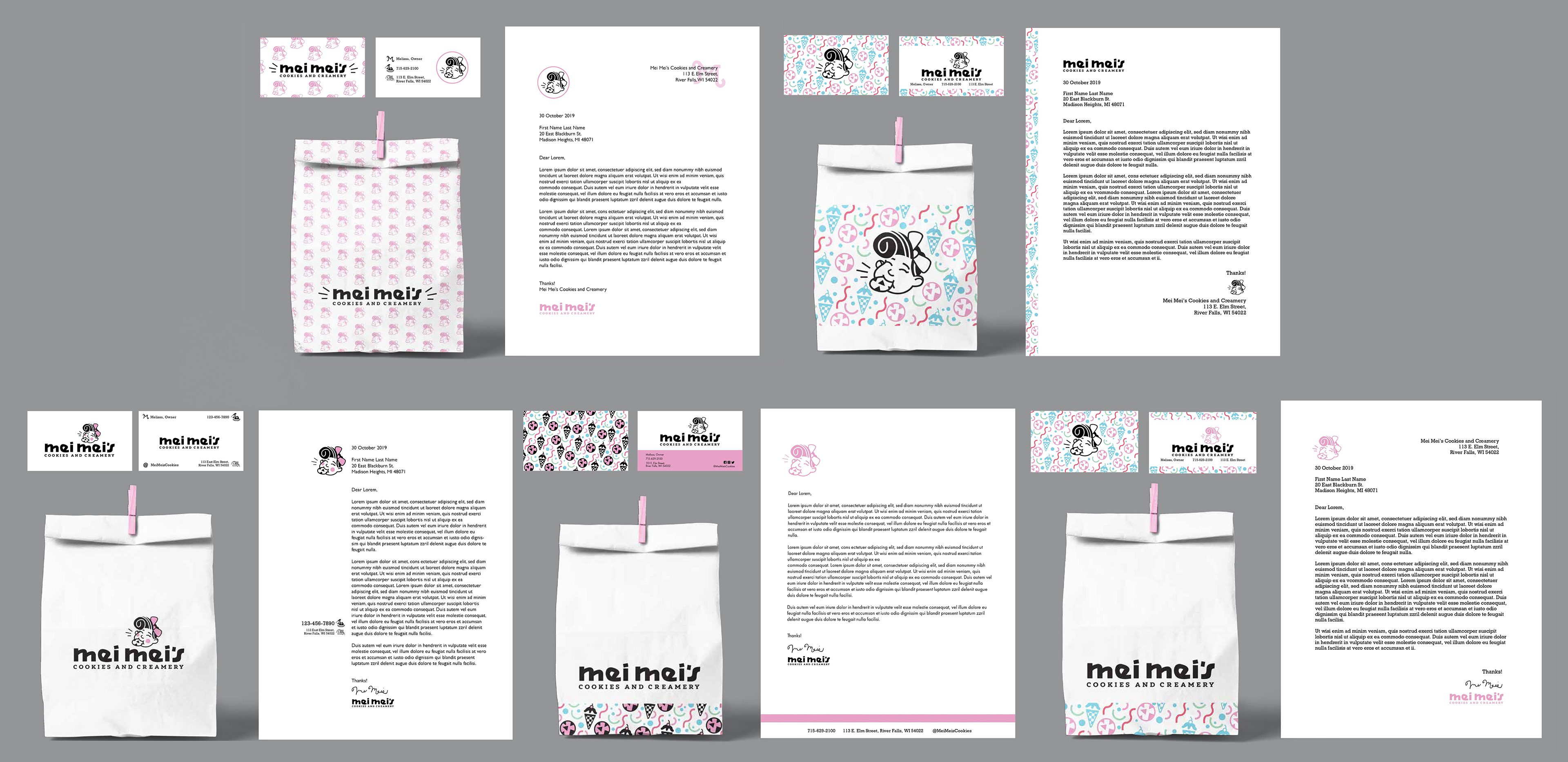
Expanding the Logos
After working on all of the separate elements, I began combining different variations of the logo mark, the logo type, and other iconography in order to start establishing the visual identity as a whole. I experimented with different patterns, compositions, and visual hierarchies. I focused on finding a design solution that was visually compelling without being too repetitive or overwhelming.
Final Result