
Mood Board
I found inspiration from various pop culture items, including game shows from the 60s, comic books from the 70s, and packaging for action figures from the 80s. I wanted to create a typeface that was energetic, familiar, and authentic.

Ideation and Iteration
Here are some of my initial ideas. I explored various potential directions, combining different characters from the images above in different combinations.

Next, I decided on a direction for the typeface. I began focusing on five letters, both with their development and establishing visual rules for the rest of the alphabet. Some characteristics that I focused on were keeping a consistent stroke weight, creating interesting ascenders and descenders, and maintaining a flow through each letter.

Expressive Type Poster: Design Process
My initial idea for the expressive poster was to have the name of the typeface interact with snaking lines. I tried adding other words but decided that I wanted to keep the design more simple. Then, I experimented with various colors, using the white lines to create an interesting visual illusion of depth and a foreground/background.

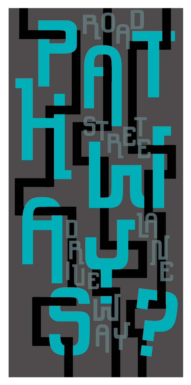


Expressive Type Poster: Final Result

Specimen Booklet
Using only typography, I designed a booklet to show the typeface's potential applications. I added colors and simple imagery to create additional visual interest. Various pages showcase the characters displayed in a wide range of sizes, and some spreads show the stylistic set, numbers, punctuation, and ligatures.


