

Mood Board
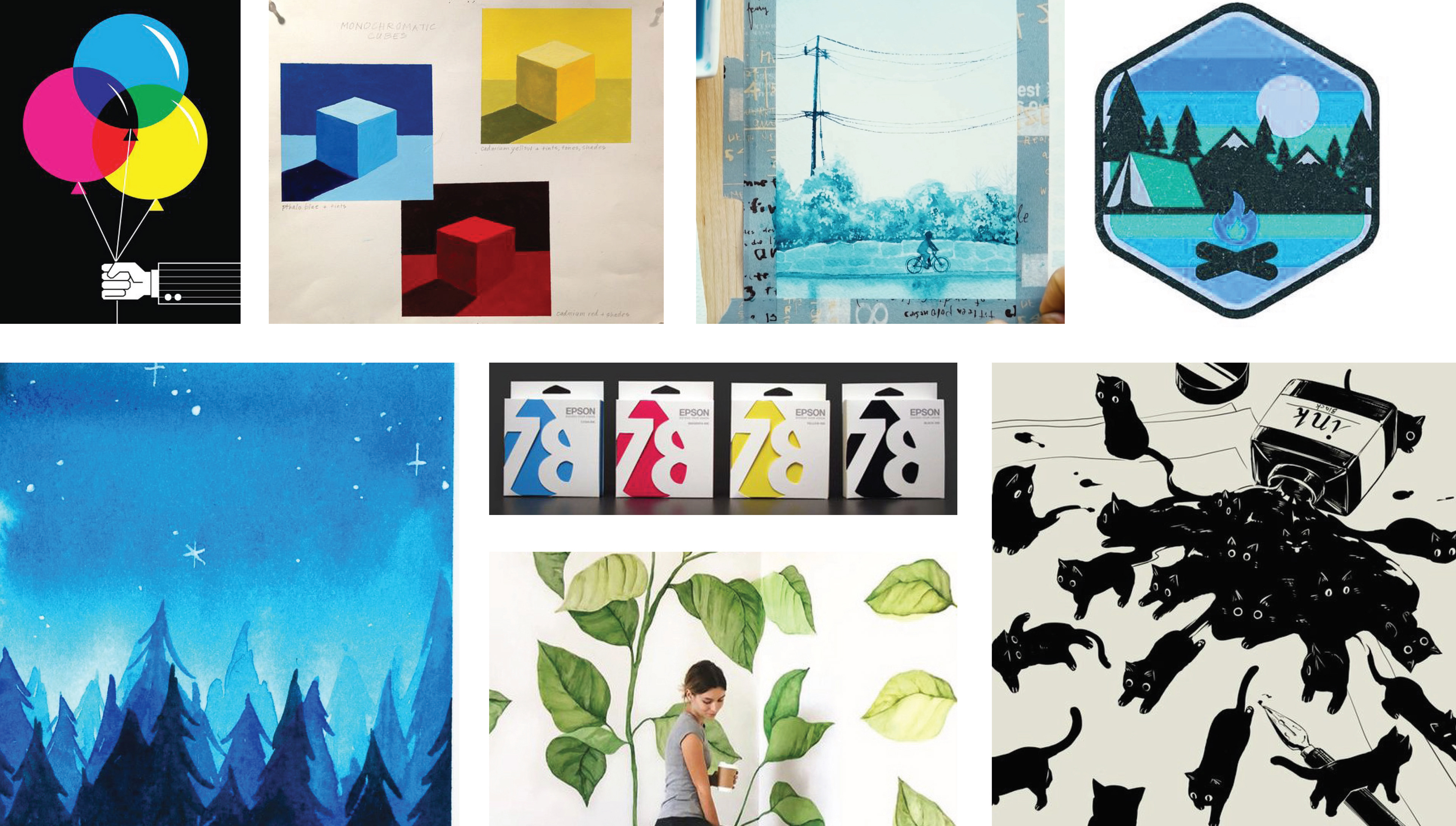
I was excited about these examples of CMYK color palettes, as well as monochromatic paintings. I also liked these examples of visuals with strong black line work and shapes. The whimsical and adventurous nature of these landscape illustrations was also a source of inspiration.
In order to come up with the label for the bottle and the dieline for the box, I looked at these examples of packaging that focus on the display of the product. I also looked these this example of bottles with vertical labels.

Process
I made a few ink paintings throughout the design of this product. With each iteration, I focused on certain aspects, like simplifying the landscape, focusing on contrast, and fully utilizing the full range of the ink. The logo started with a font found online, and was altered to better suit the rest of the branding.

Final Result


